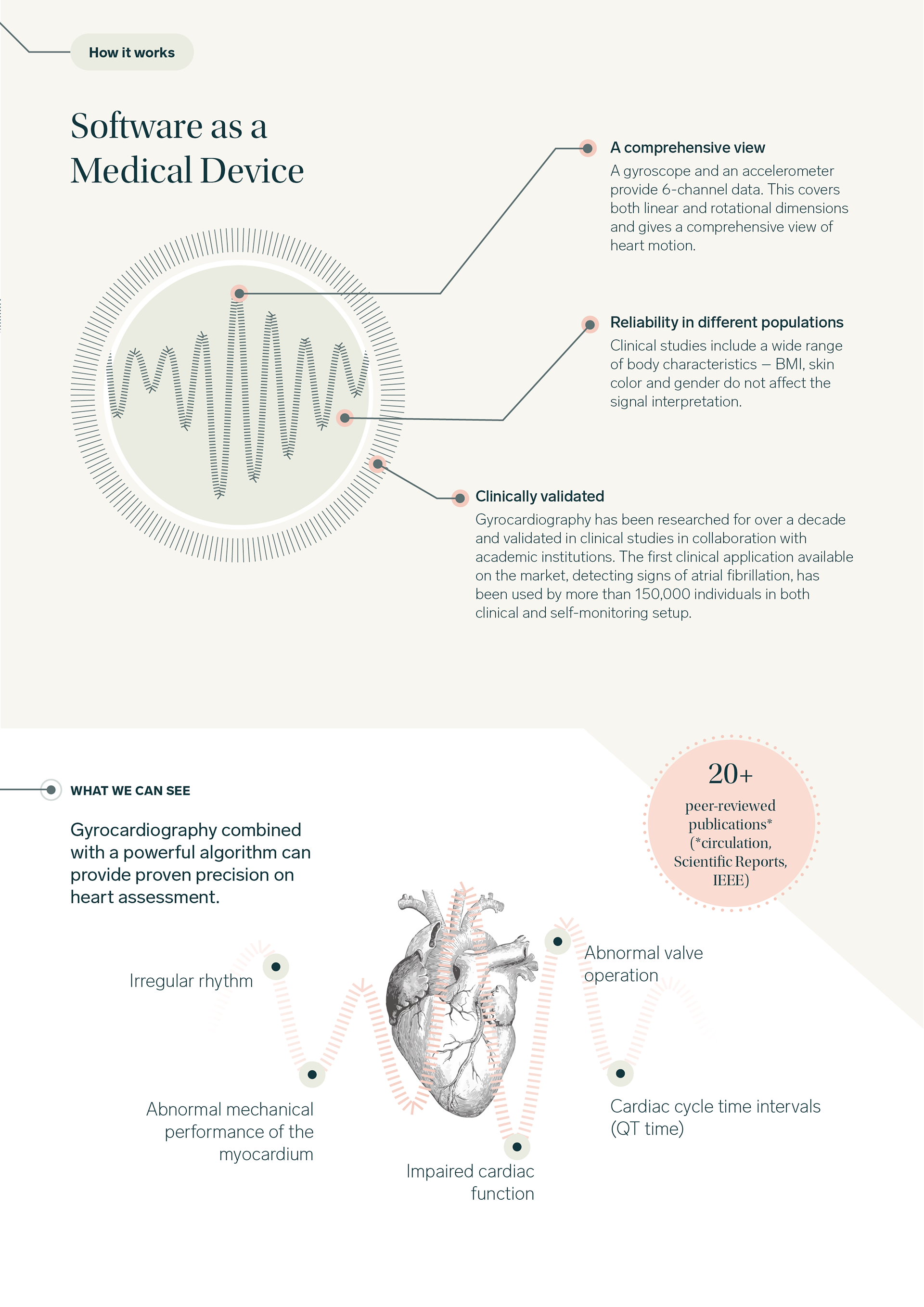

CardioSignal is a mobile app that helps detect heart conditions using your phone’s motion sensors. When I joined the team, a brand renewal had just been completed. My main responsibility was to update all key branded assets, including the mobile app’s user interface, to align with the new visual identity.

Wireframes
Before updating the app with the new branding, I created low-fidelity wireframes to quickly map out the existing user flow and identify key needs. This also allowed me to introduce new features and fill in missing information, leading to overall usability improvements.

UI/UX update
The requirements asked for minimal change for the users to still recognise the app and where everything was placed. Here there were minor but compelling updates. I placed the measure icon in the centre to give it the spotlight (icons were created by me). The start button takes the spotlight in the whole view by being the heaviest element. Simplified the instruction button by placing a standard info icon. I used Sketch app for this project.

Results view
The results view is the most important and informative screen in the app. The goal was to provide users with a clear, immediate understanding of their results at a glance. I simplified the original layout by giving the design more breathing room and visual clarity. One helpful requirement was to move the "Physiology" information to a separate tab, which allowed for a cleaner, more organized interface.

Activity view
The activity view was not accessible for colorblind users, so I introduced additional visual signifiers to improve usability for people with visual impairments. These enhancements help users distinguish between different states—such as days with atrial fibrillation, no measurements, or the current day—without relying solely on color.
Branded collaterals